
Shutterfly Mobile Redesign
Springboard Workshop

Overview
This project was developed for a UX Design class in the Springboard Workshop. I met with a mentor/professional UX designer, Kaycee, online once a week to discuss the coursework, my process, this project, and some work-related UX topics.
The class took me through the full UX design process from research (surveys and interviews), personas, information architecture, user flows, wireframes, visual design, to testing a prototype with users.
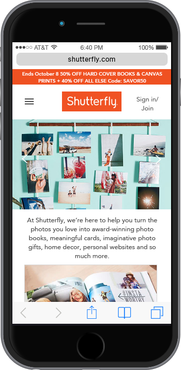
I chose Shutterfly for my Springboard project. Shutterfly is a photo website that allows users to personalize items such as photo books, greeting cards, invitations, mugs, calendars, and other home decor. My interest in the site was prompted after discussing it with a friend who is also a very frequent user of the site. Her first comment was “too much information on the page!” I took that as my challenge and opportunity for this project.
Project Goals
The goals of this project were to identify strengths and weaknesses of Shutterfly’s website and to improve Shutterfly.com’s user experience. At the time of my research, Shutterfly did not have a responsive website.
Research: User Surveys and Interviews
Methodology
Generative research was conducted in order to help understand Shutterfly users’ goals, motivations, behaviors, and frustrations while using the website.
Survey
First, I conducted an online survey with 19 questions using Typeform. I received 17 responses from Shutterfly users.
Shutterfly has an extensive e-commerce offering. I initially found it difficult to narrow my survey questions given the large variety of options that Shutterfly offers; however, I was able to capture some helpful information. The results include:
Top three uses of Shutterfly
Electronic devices used
Interviews
Interviews were conducted with three Shutterfly users and lasted on average between 30-45 minutes.
Participants
The primary characteristics of the study’s participants:
Female
Age 33-44
Technologically savvy
Married
Have children between the ages 5-10
Creative personality (designer, crafter, artist)
Affinity Diagram
I used an affinity diagram to group common themes among the survey and interview data. The affinity diagram helped me synthesize the data without subjecting it to my preconceived notions. Some common themes arose around user intent, user frustrations, and user wishes.
Among my study participants, Shutterfly.com is used as a way to create memories of users’ family and children. The photos that are used in Shutterfly’s products tend to be of milestones, events, or vacations. Most of the participants create mementos for themselves, gifts for their children, or gifts for family members. As as secondary intent, people use Shutterfly to create and purchase art products. For example, two study participants use Shutterfly.com to create artwork—for a gallery wall in their home, or for artwork to sell to others.
I found an underlying motivation among users: people love to show off their kids and thus use Shutterfly to create personalized photo books, mugs, calendars, tote bags, etc. using photos of their kids. They are created either for themselves or to give as gifts to others.
Users also shared their frustrations about the functionality of the site. Common themes were:
“Too much information on the page”
“Secondary pages are not so intuitive”
“It’s hard to know the difference between the sub-brands”
Too many pages involved in getting from point A to point B"
Through the interviews, users expressed their wishes and suggested the following improvements:
- Option to sort photo orientation (horizontal/vertical)
- Ability to zoom during preview
- More logical default settings
- Placement of buttons more intuitive
- Easier ability to reorder prints
- More variety of templates (a desire for more gender neutral options)
- Clarification around what projects can be saved
- Ability to view thumbnails of past orders
Persona
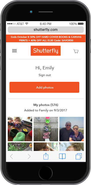
Using my research gathered from the survey and the the interviews, I created a persona, Emily.
Here are some of Emily's attitudes and behaviors:
Information Architecture
Card Sort
I performed a remote card sort with Optimal Workshop’s free online card sort in order to gain insight into how users categorize items within the site. I was limited to 10 participants. Five participants completed the card sort and five participants abandoned the sort. Ideally, I would aim for 30 participants for a formal card sort activity.
The information gathered in the card sort helped me develop the information architecture for the redesigned site. Since the site is quite large, I selected to focus on the main user experience - the users’ Shutterfly personal homepage.
User Flows
The information architecture led me to create three user flows. I choose these so that I could address some of the issues that I discovered in the research/interview phase.
Wireframes
Low Fidelity
I began with low fidelity paper sketches for two of the three user flows. While my research with users indicated that many users use the desktop to create their memories, I took a mobile first approach to the UX and UI design.

High Fidelity
After sketching on paper and incorporating feedback, I created high fidelity wireframes in Sketch. I made revisions based on Kaycee’s feedback, and asked other UX designers to review the wireframes. At the same time, I used those wireframes to create an initial prototype in InVision.
User Testing
I created an interview script and a user testing task list. I used directed tasks stating where I wanted the user to start and what I wanted him/her to achieve. I selected the tasks based on user flows and wireframes, and made sure that the tester knew that the mobile site was the subject of testing, and not him/her. I tested the prototype with three users.
Feedback on the wireframes and on the prototype included:
Some photos seemed too small to tap
Some buttons seemed to be a bit close together
Easy to use
One person commented on the vertical date scroll on the side. It reminded her of Contacts on the iPhone and was familiar once she took note of it.
One prototype user said that she users her phone for most tasks and found the wireframes to be easy. She also said that she tried to use Shutterfly in the past using her phone, but ultimately had to use her desktop. She didn't recall if the issues were with Shutterfly's site or user error.
Overall the testing went well and the users were able to accomplish the tasks without issues.
My biggest realization from creating the wireframes is that the smallest interaction needs to be thoughtfully considered. This process has made me look at screens, apps, and websites with a deeper appreciation.
Visual Design
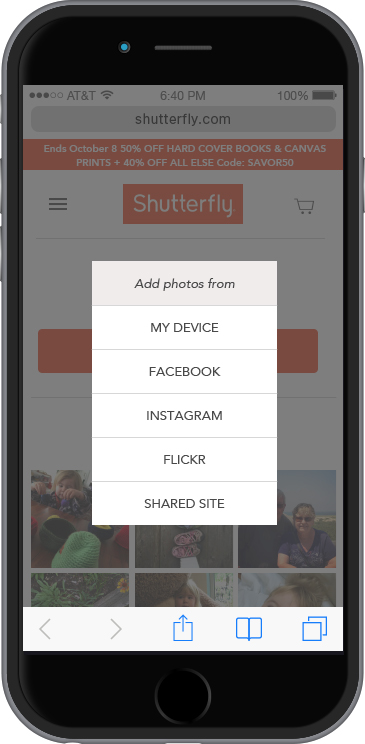
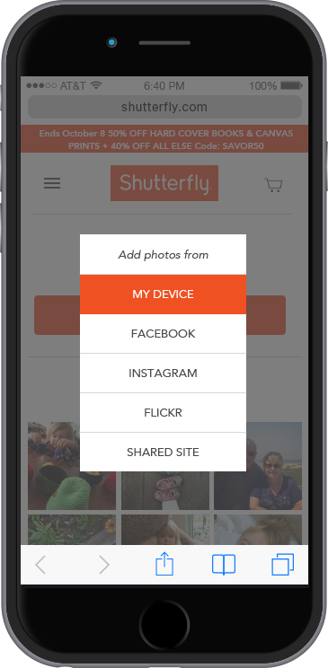
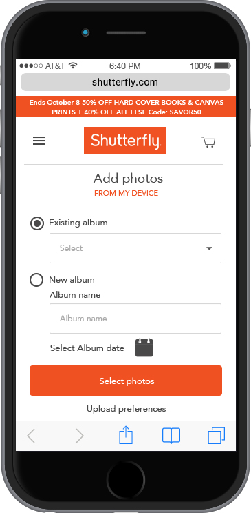
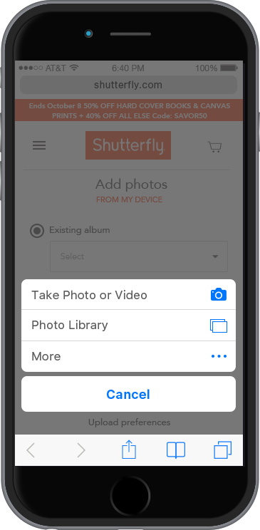
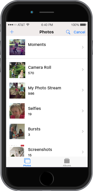
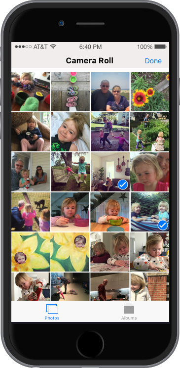
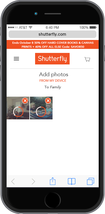
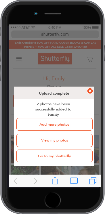
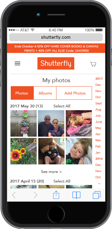
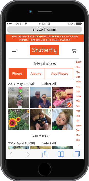
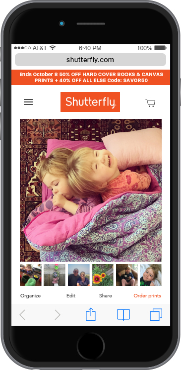
Upload a photo
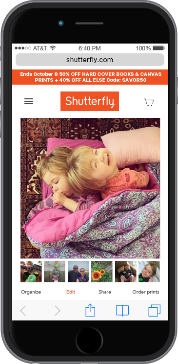
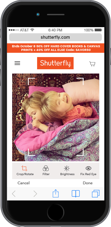
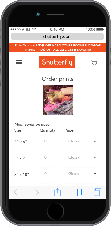
Edit a photo and add it to your shopping cart
UI Style Guide
In addition to applying the visual design to the wireframes, I created a style guide to ensure consistency throughout the site.
Shutterfly has an established brand and a highly recognizable logo using the color orange. Given the strength of the brand, I maintained Shutterfly’s existing color palette.
I also maintained the font used in the existing website. Avenir is a sans serif font with a human touch. With its friendly and inviting font characteristics, it is a good match to the Shutterfly family-oriented brand.
Takeaways
This project was a great opportunity for me to experience the entire UX process using a personal project as an example. At the same time, I've been able to apply much of the workshop content and UX processes to my professional projects. Incidentally, this workshop coincided with my work on the launch of the Northeastern Magazine website. I look forward to continuing to infuse a user-centered mindset in all of my projects.